
Appearance
Transformation
The **Transformation Section is designed to show a clear, simple process that helps customers understand how they can achieve results or benefits with your product/service. It usually follows a **“3 Easy Steps” style with visuals, short text, and numbered highlights. 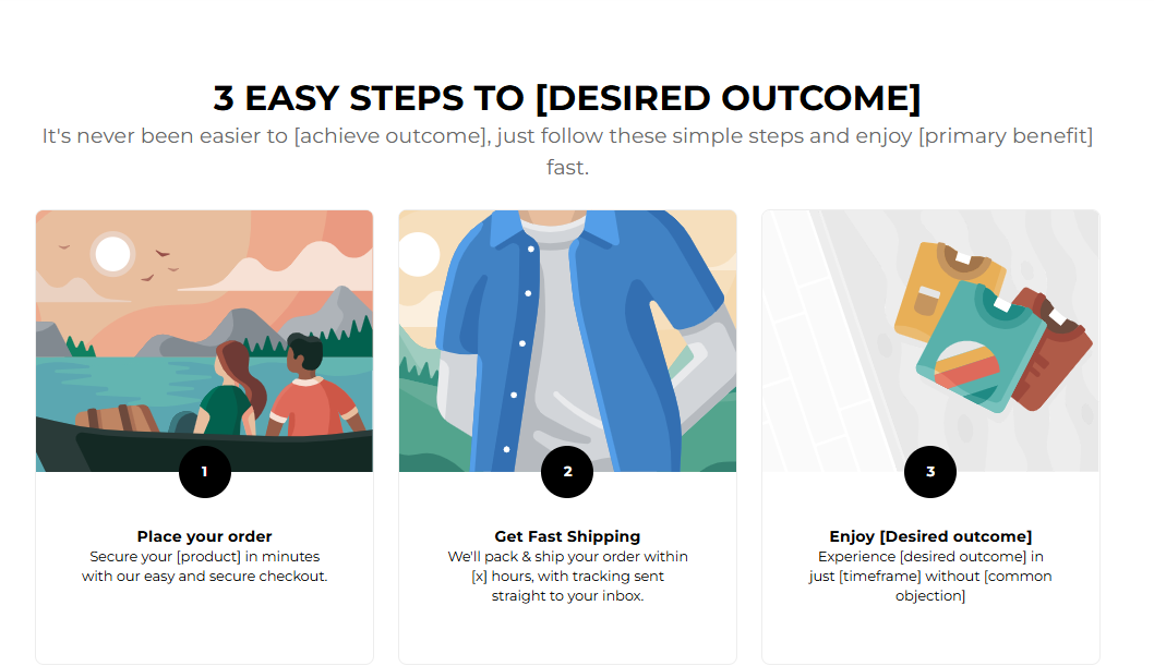
Adding The Section To Your Store
- Open your theme editor.
- Click on “Add Section”
- Find and add the “Transformation” Section from the block library
Styling The Section
The Transformation section visually walks customers through the journey of achieving results with your product or service, often in a simple “3 Easy Steps” or “Before & After” format. It’s perfect for demonstrating ease of use, showcasing progress, and building trust through clear, outcome-focused storytelling.
Use this section to simplify complex processes, motivate buyers with visual proof, and help them clearly see the value your product delivers over time.
Step 1 – General Settings
Below is a list of all the general settings found on all sections built inside Momentum Theme
Background Color Set the backdrop of the gallery. Transparent blends with the page background. Use a subtle solid color if you want images to stand out more.
Heading Size (Small / Medium / Large)
Control the size of your headline choose Small, Medium, or Large depending on how prominent you want your section title to appear. Headline Typography (AA / Aa / aa)
AA = ALL CAPS (bold and strong). Aa = Title Case (professional). aa = lowercase (minimal, casual). Font Family Default: Use your global theme fonts to style the section. Custom: Allows you to select an alternative font to style this section
Example: Montserrat is a clean and legible font for modern looking stores.
Title Color Titles: Sets the colour of the blocks main headline
Subtitles & Body Text: Sets the colour of the subtitle and card copy
Verified Text: sets the colour of the “Verified Customer” tagline.
Heading Alignment Choose alignment: Sets the position of the headline and supporting copy Left, Center & Right Aligned. The center option is most common for galleries. Section Width Full Width: Block spans the entire width of the screen. Contained: Adds side margins for a neat look.
Padding (Desktop & Mobile) Controls spacing around the gallery elements both horizontal and vertical
Example: Desktop Horizontal = 70px (wide margins).
Mobile Horizontal = 15px (compact for small screens).
Display OnChoose where to show the section. Default: All Devices. Numbers Background & Numbers Color
Controls how the step numbers look. Set your background: #000000 (black).
Set your text Color: #FFFFFF (white).
Makes numbers stand out against the design.
Step 2 – Content Settings
This allows you to customize the content of your headline and subtitle.
Title This explains the transformation process in a simple phrase.Example: “3 Easy Steps to [Desired Outcome]”.
SubtitleAdd a little more context to your content. Example: “It’s never been easier to [achieve outcome], just follow these simple steps and enjoy [primary benefit] fast.”
💡 Tip: Keep both title and subtitle short, clear, and benefit-driven.
Step 3 – Product Cards Settings
These are the controls for styling the individual cards. Here’s more about these settings:
Container Styling (Card)
You have three options to choose from: Card, No Card, Shadow. Card: Each image or gallery item is placed inside a boxed card with a defined background. Useful when you want separation between items or to make each image stand out very clearly.No Card: Displays images without any background box or border — they sit directly on the page background. Best for minimalist or lifestyle-style galleries where visuals flow naturally with the page. Shadow: Adds a soft drop shadow beneath each item, giving the appearance of gentle elevation. Ideal for making images pop off the page while still keeping a sleek layout. Box Shadow (Offset, Blur, Spread, Color) Adds depth to cards for a modern, layered effect.
Card Background Transparent: Keeps focus on images. Solid color: Can create a consistent card look.
Card Border & Border Color Defines card outlines (default is none).
Container Corner Radius Example: 10px — softens card edges.
Step 4 – Block Settings
These settings allow you to configure and customize your card block.
Block Name: Card
Each Card represents one step in the transformation journey. Image Upload or select a step-related image. Example: Checkout icon, delivery truck, happy customer.
Title Short action-oriented phrase. Example: “Place your order”.
Text Describes the step in one sentence. Example: “Secure your [product] in minutes with our easy and secure checkout.”
Number Defines the order of the step (1, 2, 3…). Numbers are styled with the background and color you set earlier.
Card Styling, Number Badges and Fonts per Step
Added in Momentum 1.1.0 (October 2026).
Number badges (section settings)
Next to Numbers Background and Numbers Color, the step numbers now have a border:
- Numbers border width – 1–4 px, default 1 px.
- Numbers border color – leave empty to match the numbers background (the border is then invisible). Pick a color for an outlined badge, e.g. a white badge with a black border.
Card colors (section settings)
- Card background is set under Card styling → Custom and only appears when Container styling is Card or Shadow (with No card there is no card to color).
- Card border and Card border color only appear with Container styling Card.
- Box text color is now called Card text color.
- The former Box background color (under custom colors) has been removed. If you used it, set Card styling to Custom and enter the color under Card background.
Styling a single step (block settings)
Each card block can now override the section settings, so you can highlight one step, e.g. the final result:
| Heading in the block | Settings |
|---|---|
| Number colors | Numbers background, Numbers color. Leave empty to use the section setting. |
| Number border | Use section setting (default) or Custom: Numbers border width (1–4 px) and Numbers border color |
| Card styling | Use section setting (default) or Custom: Container styling (No card / Card / Shadow), Card background, Card text color, Card border (0–5), Card border color, Container corner radius (0–50 px), and vertical/horizontal card padding for desktop and mobile (0–60 px) |
| Card shadow | Only with Container styling Shadow: Box shadow offset, Box shadow blur, Box shadow spread, Box shadow color |
| Typography | Use section setting (default) or Custom: Title size, Text size (Small / Medium / Large / Extra Large), Title typography (AA / Aa / aa / None) and Font family (Default by theme or Own choice with a Regular font picker) |
Color fields left empty always fall back to the section setting, so you only fill in what should be different.
Button type
The section button now has a Button type setting: Custom link (as before) or Add to cart. See Section Buttons: Add to Cart & Go to Checkout for details.
Best Practices
Keep titles very short (2–4 words). Use icons or clean images for each step. Make sure step numbers stand out for easy scanning.
Always frame steps as a benefit-driven journey (from start to result).
FAQs
Q1. What images work best here? A1: Simple icons, lifestyle images, or product close-ups that visually support each step. Q2. Can the numbers be styled differently? A2: Yes, you can change the background number and text color in General Settings. Q3: How do I make the steps appear horizontally on desktop but stacked on mobile A3: The layout automatically adapts as it’s responsive by default. You don’t need to configure anything; the section handles this automatically. Q4: Can I hide the numbers and just show the text and icons? A4: Yes. In General Settings, you can set the Numbers Background and Numbers Color to “Transparent.” This effectively hides them while keeping spacing consistent.
Troubleshooting
Numbers not showing clearly? Adjust contrast between Numbers Background and Numbers Color. Images not displaying? Make sure an image file is uploaded or selected from the free image library. Steps not aligning properly on desktop view? Check Section Width and Padding under General Settings. Uneven padding or switching between “Full Width” and “Contained” layouts can cause misalignment. Images look stretched or blurry?Use square or consistent aspect ratio images (e.g., 1:1 or 4:3). Blurry visuals usually mean low-resolution uploads. Aim for at least 800×800px per image.
Testing Checklist
Title and subtitles explain the transformation process clearly.
Numbers are visible and styled properly.
Each card has an image, title, text, and number.
The section looks good on both desktop and mobile.
Steps flow logically and end with the desired outcome.