
Appearance
Benefits Timeline
Note (Momentum 1.0.0, August 2026): Each layout (Timeline / Image Timeline) has its own heading and subheading fields — only the active layout's fields are shown in the customizer, and only those are rendered. Leaving a field empty renders nothing. (Earlier builds could show the other layout's demo text when a field was left empty; this is fixed.)
The Benefits Timeline section helps you visually show customers what results they can expect over time. This builds trust, transparency, and motivation by setting realistic expectations. 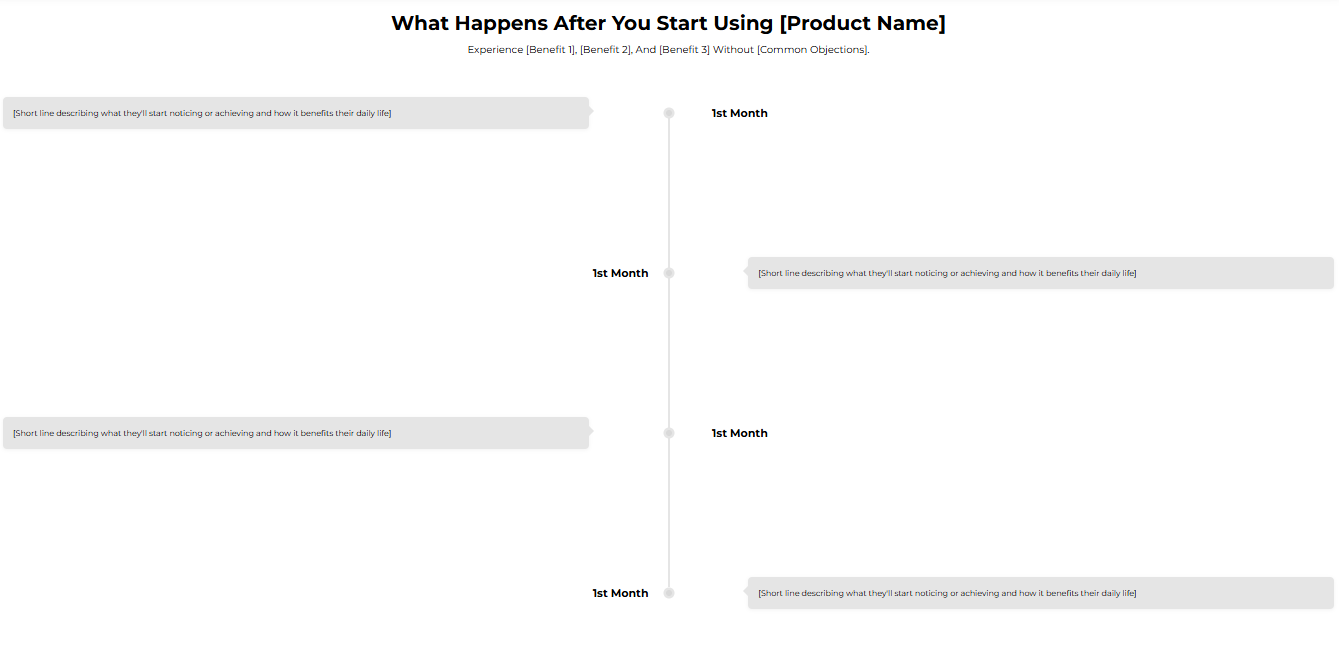 *Adding The Section To Your Store
- Open your theme editor2. Click on “Add Section”
- Find and add the “Benefits Timeline” Section from the block library
Styling The Section
The Benefits Timeline section lets you visually showcase the progress or transformation customers can expect over time, whether it’s product results, milestones, or a step-by-step journey. This section helps you set clear expectations, build trust, and create motivation by showing tangible outcomes.
You can use it to illustrate how your product works across days, weeks, or months. For example, Week 1: Noticeable boost in energy, Week 4: Visible results. Step 1 — General settings
Below is a list of all the general settings found on all sections built inside Momentum Theme
Background Color
Set the backdrop of the gallery. Transparent* blends with the page background.
Use a subtle solid color if you want images to stand out more.
Heading Size (Small / Medium / Large)
Control the size of your headline choose Small, Medium, or Large depending on how prominent you want your section title to appear.
Headline Typography (AA / Aa / aa)
AA = ALL CAPS (bold and strong).
Aa = Title Case (professional).
aa = lowercase (minimal, casual).
Font Family
Default: Use your global theme fonts to style the section.
Custom: Allows you to select an alternative font to style this section
Example: Montserrat is a clean and legible font for modern looking stores.
Title Color
Titles: Sets the colour of the blocks main headline
Subtitles & Body Text: Sets the colour of the subtitle and card copy
Verified Text: sets the colour of the “Verified Customer” tagline.
Heading Alignment
Choose alignment: Sets the position of the headline and supporting copy Left, Center & Right Aligned. The center option is most common for galleries.
Section Width
Full Width: Block spans the entire width of the screen.
Contained: Adds side margins for a neat look.
Padding (Desktop & Mobile) Controls spacing around the gallery elements both horizontal and vertical
Example: Desktop Horizontal = 70px (wide margins).
Mobile Horizontal = 15px (compact for small screens).
Display On
Choose where to show the section. Default: All Devices.
Timeline Background Color for the timeline bar (example #FC4F00).
Timeline Title Color & Text color Colors for title (on timeline) and main body. Ensure the text reads clearly on the timeline background; use white text if the timeline color is dark.
Dot Color Choose color for milestone markers.
Step 2 — Content Settings
Allows you to customize the content of your headline and subtitle.
Title
A short, attention-grabbing line showcasing your product USP and value proposition. Example: “Real Results in Action”.
Subtitle
Builds curiosity, trust, or emotional connection.Example: “Trusted by athletes worldwide to fuel performance.
Uppertitle
Small pre-heading (e.g., Reviewed by 100+ happy customers) — Also acts as social proof.
? Tip: Keep this section simple, emotional, and benefit-focused.
Step 3 — Block: Milestone settings.
This setting allows you to define and customize each key point in your timeline or progress section. Each Milestone block contains:
Month Label for milestones (e.g., 1st Month, 3rd Month). You can use Week 1, Week 4, etc. Keep consistent units.
Description Short, concrete outcome (1–3 sentences). Example: You’ll start to feel a noticeable boost in energy...
Icon Optional icon (recommended 200x200px if used). Use SVGs where possible.Additionally, remember that you can fetch icons from Google fonts as an option.
Tip: Keep each description similar length to avoid layout jumps.
Best practices
Use 3–5 milestones. This keeps the timeline digestible.
Use consistent labels (months/weeks) across the timeline.
Make each description actionable and believable (don’t promise unrealistic outcomes).
Add an attribution line (Based on verified customer feedback) if using real data.
Use contrast for timeline text so it’s legible on colored timeline backgrounds.
FAQs
Q: Can I change months to weeks? A: Yes, labels are customizable. Use whichever unit reflects product results.
Q: Should milestones be visually connected? A: Yes the timeline line (and dot color) should visually connect milestones to show progression.
Troubleshooting
Icons appear in different sizes → re-export icons on the same canvas size.
Text overflow on mobile → shorten descriptions or increase vertical padding for mobile.
Timeline color hides text → choose stronger contrasting text color or lighter timeline background.
Testing checklist
Milestone labels are consistent (units & order).
Descriptions are short, accurate and of similar length.
Timeline background & dot colors contrast with text.
Icons are uniform and load quickly.
Timeline reads as clear progression on both desktop & mobile.