
Appearance
Hero Banner
**Overview
The **Hero Banner is one of the most important **sections in the Momentum Theme. It’s the first thing visitors see when they land on your store, making it your primary opportunity to grab attention, communicate your core value proposition, and drive immediate action.
As shown in the editor flow, the Hero Banner can be added, duplicated, and fully customized, including headlines, subtext, visuals, and call-to-action buttons, all directly within the Theme Editor.
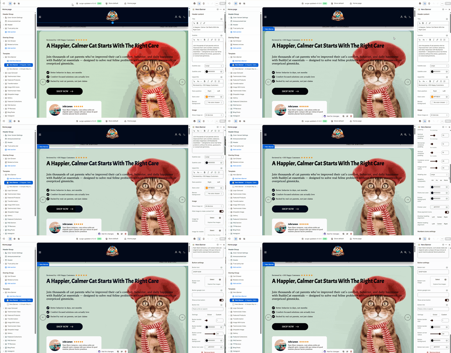
**Step-by-Step Guide
**1. Open the Theme Editor
- In your Shopify admin, go to Online Store → Themes
- Click **Edit Theme **on your active Momentum theme
**2. Navigate to the Page
- Use the top dropdown (e.g., Home page) to select where your Hero Banner will appear
**3. Add or Manage Hero Banners
- In the left sidebar under **Template, locate **Hero Banner
- Click Add Hero Banner to create a new one
- You can also duplicate existing banners to create multiple slides
**4. Edit Hero Banner Content
Click on a Hero Banner block to customize:
Title (Headline) Your main hook (e.g., value proposition or big promise)
Subtitle (Supporting Text) Expand on your offer and explain the benefit
Uppertitle (Optional) Add trust signals (e.g., “Reviewed by 100+ Happy Customers”)
Bullet Points Highlight key benefits or features
CTA Button Customize text (e.g., “Shop Now”) and link
**5. Customize Visuals
- Upload or change the Hero Image
- Ensure the image aligns with your product and messaging
- Optimize for both desktop and mobile views
**6. Adjust Styling Options
- Text Size & Colors – Match your brand identity
- Star Ratings – Enable and position (left or right)
- Alignment & Layout – Adjust spacing and positioning for clarity
- Slider Controls – If using multiple banners, configure navigation arrows or transitions
**7. Arrange the Section
- Drag and reposition the Hero Banner within the page layout
- Typically placed at the very top of the homepage
**8. Save Your Changes
- Click Save in the top-right corner
Review Card Styling (Hero Banner)
Added in Momentum 1.1.0 (October 2026).
Each Hero Banner block can show a small customer review card. Its settings are under the Review block 1 heading of the block:
| Setting | What it does |
|---|---|
| Review show | On / Off |
| Review card border radius | 0–50 px, default 14 px. Set it to 0 for square corners. |
| Remove circular frame from review image | Off (default): the review image is cropped into a circle. Turn it on for rectangular logos, e.g. from a magazine or partner, so they display without cropping. |
| Colors | Custom (default) or Use color scheme (follows the section color scheme / theme colors) |
| Review background color, Review text color, Review title color, Review border color, Stars color | Only with Custom colors |
| Stars position | Right (default) or Left of the review title |
| Border width | 0–10 px, default 1 px |
| Review background opacity | 0–1, default 1 (fully opaque) |
| Review image | 200 × 200 px for circular photos; use a rectangular logo when the circular frame is removed |
| Review text sizes | Custom (default) unlocks Review text size and Review title size (Small / Medium / Large / Extra Large). Use theme default follows Theme settings → Typography. |
💡 The former checkbox Remove review card border radius has been replaced by the Review card border radius slider. If you had used the checkbox, set the slider to 0 to get square corners again.
Button Type (Hero Banner & Hero Banner Slideshow)
The button of each Hero Banner block, and both buttons (primary and secondary) of each Hero Banner Slideshow slide, now have a Button type setting: Custom link (as before) or Add to cart. With Add to cart, the button adds a selected product to the cart and can send the customer straight to checkout. See Section Buttons: Add to Cart & Go to Checkout for details.
Typography (Hero Banner Slideshow)
The Hero Banner Slideshow section has a new Heading & text sizes setting. Custom (default) keeps the Headline size and Subheadline size settings; Use theme default follows Theme settings → Typography. Under Font family you can switch from Default by theme to Own choice and pick a separate font for this section.
**Tips for Best Results
- Focus on **one clear message, **avoid clutter
- Use benefit-driven headlines, not just product names
- Pair your message with a high-quality, relevant image
- Keep CTAs clear and action-oriented
- Test multiple banners to see what converts best
**Need Help?
If you need help, contact our support team and we'll be happy to assist.