
Appearance
Advertorial Sidebar Benefits
**Overview
The Advertorial Sidebar Benefits section allows you to display a list of key benefits, value propositions, or trust-building points alongside your advertorial content. This section is designed to help reinforce your offer, highlight important product advantages, and improve reader engagement without interrupting the main article flow.
Common uses for this section include:
- Highlighting product benefits
- Displaying key selling points
- Reinforcing trust and credibility
- Showcasing guarantees, features, or outcomes
- Improving advertorial conversion rates
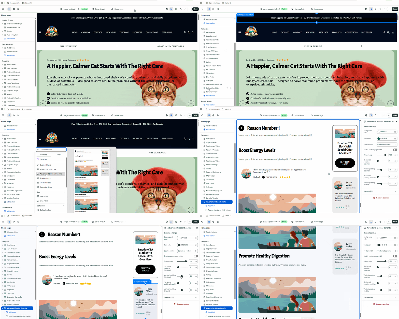
**How to Configure the Advertorial Sidebar Benefits Section
**Step 1: Open the Theme Customizer
- From your Shopify Admin, navigate to Online Store → Themes.
- Locate your active Momentum Theme.
- Click Customize.
**Step 2: Open Your Advertorial Template
- In the template selector at the top of the Theme Editor, choose the Advertorial page you want to edit.
- Locate the Advertorial Sidebar Benefits section within the template structure.
**Step 3: Edit the Section Content
- Click on Advertorial Sidebar Benefits.
- Update the section settings as needed, including: Benefit titles
- Benefit descriptions
- Icons or visual indicators (if enabled)
- Layout and display options
As you make changes, the preview will update in real time.
**Step 4: Add, Remove, or Reorder Benefit Items
Within the section settings, locate the individual benefit blocks.
To add a new benefit: Click Add Block.
Select the appropriate benefit block type.
Enter your content.
To remove a benefit: Open the block settings.
Click Remove Block.
To reorder benefits: Drag and drop the blocks into your preferred order.
**Step 5: Customize Styling
Depending on your theme version, you may also have options to customize:
- Text alignment
- Colors
- Typography
- Spacing
- Icons
- Desktop and mobile visibility
Adjust these settings to match your brand and advertorial design.
**Step 6: Save Your Changes
Once you're happy with the configuration:
- Click Save in the upper-right corner of the Theme Editor.
- Preview your advertorial page on both desktop and mobile devices to ensure the sidebar displays as expected.
Block Styling Options
Added in Momentum 1.1.0 (October 2026).
The blocks of this section can now be styled individually. The block names in the theme editor are Reason Numbered (left), Boost Energy (left), Promote Healthy (left), Emotive CTA (sidebar) and Testimonial (sidebar).
Block colors and padding
The three content blocks (Reason Numbered, Boost Energy, Promote Healthy) have their own Block colors and Block padding settings:
| Setting | What it does |
|---|---|
| Colors | Use color scheme (follows the section color scheme / theme colors) or Custom (default) |
| Background color, Heading color, Text color, Border color | Only with Custom colors |
| Border width | 0–6 px, default 0 (no border) |
| Horizontal / Vertical padding (desktop) | inner spacing of the block, default 0 |
| Horizontal / Vertical padding (mobile) | the same for mobile, default 0 |
| Border radius | 0–50 px, default 0 |
Use these to turn a block into a highlighted box, e.g. a light background, a 1 px border, 24 px padding and a 12 px radius.
The sidebar blocks (Emotive CTA and Testimonial) have Block padding and Border radius as well, with defaults that match their previous look (desktop 20–24 px horizontal / 30 px vertical, mobile 20 px, radius 16 px).
Reason Numbered (left) also has a new Badge border color for the number badge.
Review card (Boost Energy block)
The review card inside the Boost Energy (left) block has its own Review card settings:
| Setting | What it does |
|---|---|
| Colors | Use color scheme or Custom (default) |
| Background color, Review text color, Name color, Verified text color, Border color, Star color | Only with Custom colors |
| Border width | 0–10 px, default 1 px |
| Border radius | 0–50 px, default 14 px |
| Review background opacity | 0–1, default 1 (fully opaque). Lower values let the block background shine through. |
| Show original image shape | Off (default): the avatar is cropped into a circle. On: the avatar is shown as uploaded, e.g. for a rectangular logo. |
| Show verified buyer | Shows or hides the "verified" line under the name |
| Heading & text sizes | Custom (default) unlocks Review text size, Name size and Verified size (Small / Medium / Large / Extra Large). Use theme default follows Theme settings → Typography. |
Image fit (Promote Healthy block)
Image fit controls how the block image fills its frame:
- Original (default) – the image is shown with its own proportions.
- Contain – the whole image is visible inside the frame; empty space may remain.
- Cover – the image fills the frame completely; edges may be cropped.
Button (Emotive CTA block)
- Button type: Custom link or Add to cart. With Add to cart, pick a product under Choose product for adding to cart and decide whether Go directly to checkout is on. Details in Section Buttons: Add to Cart & Go to Checkout.
- Button style: Settings = Global (default, uses Theme settings → Buttons) or Custom, which unlocks Button border size, Button border color, Button corner radius, Button background and Button text color.
💡 If you had set custom button colors in the Emotive CTA block before the update, check the button after updating. If it now shows the global button style, set Settings to Custom and enter your colors again.
Heading & text sizes
The former Heading size setting in each block is now called Heading & text sizes. It works the same way: Use theme default follows Theme settings → Typography, Custom lets you set the sizes per block.
The Same Options in Other Advertorial Sections
The advertorial sections Final CTA and Advertorial Image Txt received matching options:
- Final CTA → Button block: Button type (Custom link / Add to cart) and Button style (Global / Custom: border size, border color, corner radius, background, text color). The former fixed Button background color is replaced by the Button style settings.
- Final CTA → Review card block: Border width, Border radius, Review background opacity, Show original image shape, and Heading & text sizes with Review text size, Name size and Verified size.
- Advertorial Image Txt → Button & review summary block: Button type and Button style, as above. The button colors moved from the section settings into this block.
- Advertorial Image Txt → Review card block: the full review card styling described above (colors, border, radius, opacity, avatar shape, verified buyer, sizes).
- Advertorial Image Txt → Heading, Date, Author, Description blocks: each has its own Heading & text sizes with a Size setting.
**Pro Tip
Keep your sidebar benefits concise and outcome-focused. Instead of listing generic features, highlight the specific results or value customers can expect. This typically creates a stronger impact and improves engagement with your advertorial content.
**Need Help?
If you have any questions or run into any issues while configuring the Advertorial Sidebar Benefits section, we're here to help.
Contact our support team and we'll be happy to assist.