
Appearance
Image With Text
The **Image With Text section is designed to highlight a **key product benefit or brand story with a strong headline, supporting description, benefit icons, and a CTA button. This layout is highly effective for conversion-focused storytelling. 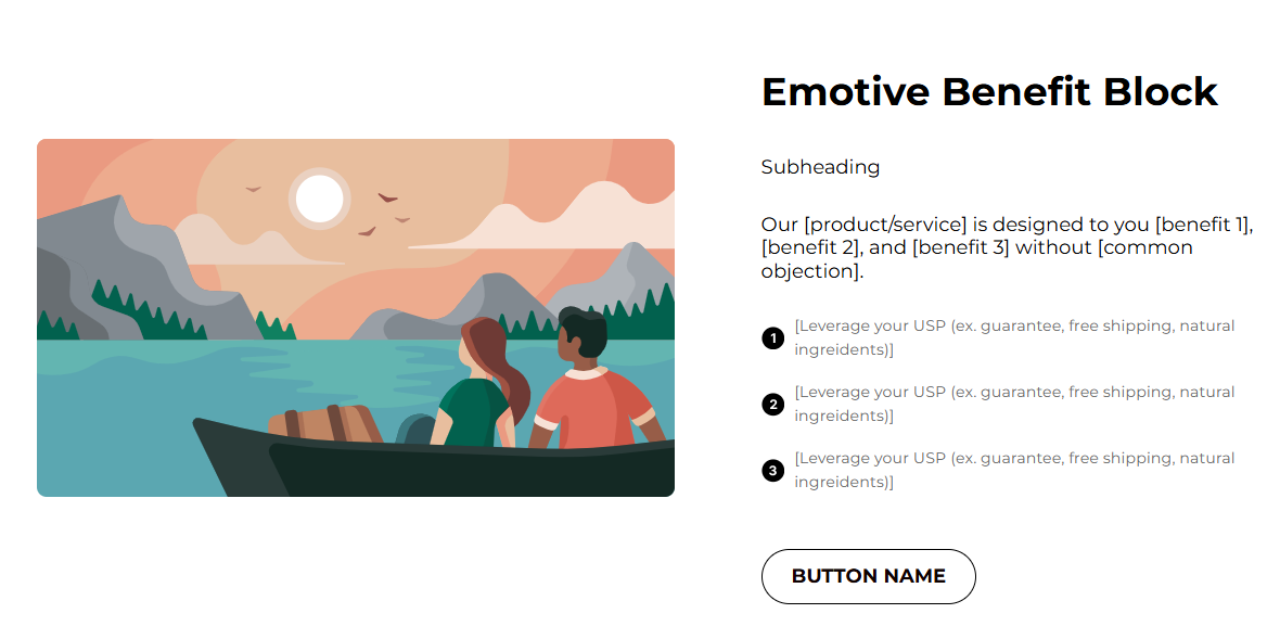
Adding The Section To Your Store
- Open your theme editor.2. Click on “Add Section”
- Find and add the “Image With Text Section” from the block library.
Upload the main image and add Icon Blocks for each benefit.
Styling The Section
The Image With Text section is a perfect way for blending visuals with persuasive copy that drives engagement and sales. Use it to tell your story, explain your product’s value, or guide users toward a specific action like exploring a collection or learning more about other products they might be interested in.
By balancing striking imagery with concise, benefit-focused text, this section helps create emotional connection and convert browsing into buying.
Below is a list of all the general settings found on all sections built inside Momentum Theme.
Header Content (Title / Description) Primary headline and supporting paragraph. Keep the headline strong, description short, benefit-driven, and trust-building. (1-3 sentences).
Background Color Set the backdrop of the gallery. Transparent blends with the page background.
Use a subtle solid color if you want the section to stand out more.
Title Size / Headline Typography Control the size of your headline choose Small, Medium, or Large depending on how prominent you want your section title to appear.
AA = ALL CAPS (bold and strong). Aa = Title Case (professional). aa = lowercase (minimal, casual). Text Color Controls the color of all text elements in that block including the title, description, and button text (if applicable). Padding (Desktop & Mobile) Controls spacing around the gallery elements both horizontal and vertical
Example: Desktop Horizontal = 70px (wide margins).
Mobile Horizontal = 15px (compact for small screens)
Display On Choose the device types where you would like to display this. Choose All for all device types.
Image Position (Left / Right) Choose placement; alternate across sections on page for visual rhythm.
Image Upload Desktop image 1200–1600px; mobile optimized image if possible.
Step 2 – Icon Settings
This settings allows you to customize the image and text for your icons. Icon Image Small icon (SVG preferred, 24 - 48 px).
Text for Point One sentence benefit. Example: Supports strength and endurance for every training session.
💡 Pro tip: You can always fetch ready-to-use Icons from Google fonts instead of trying to spend hours finding custom assets.
Recommended: 3 points: Strength, Recovery, Convenience.
Step 3 – Button settings
This section allows you to control how your call-to-action buttons look and behave.
Button Text BUY NOW, Shop Now, etc. Keep it short and action-oriented.
Button Link Pick the link of your product or collection.
Settings Global / Custom Global uses global theme settings; while Custom lets you override.
Button Border Size, Color, Corner Radius Example: Border 1px #000000 with Transparent BG or a colored background for emphasis.
Button Background & Text Color Ensure contrast (BG #FC4F00, Text #FFFFFF recommended).
Best practices
Use an image that ties to the text (product in use, lifestyle). Keep CTA near the top of the text column so users don’t have to scroll.
Use 3 benefit driven points, concise and specific. Ensure the image is responsive, supply a mobile-optimized version.
Use “social proof” nearby (reviews/trust badges) to increase conversion.
Button Type and Font Family
Added in Momentum 1.1.0 (October 2026).
- Button type: the primary button and the secondary button each have their own Button type: Custom link (as before) or Add to cart. With Add to cart, pick a product under Choose product for adding to cart and decide whether Go directly to checkout is on. A typical setup: primary button "Buy now" as Add to cart, secondary button "Learn more" as Custom link. See Section Buttons: Add to Cart & Go to Checkout for details.
- Font family: switch from Default by theme to Own choice to pick a separate Regular font for this section.
Video With Text
The Video With Text section works like Image With Text, with a video instead of an image. It has the same button options (primary and secondary button, each with Button type), plus these video settings:
| Setting | What it does |
|---|---|
| Video position (desktop) | Left (default) or Right of the text |
| Video position (mobile) | Top (default) or Bottom. New: the video can now sit below the text on mobile, e.g. so the headline is seen first. |
| Video source | Shopify-hosted (upload) or YouTube / Vimeo (URL) |
| Video accessible title (optional) | Title for screen readers on embedded videos. Leave blank to use the section title. |
| Show controls, Autoplay, Loop, Muted | Playback options; Autoplay, Loop and Muted apply to Shopify-hosted videos only. Autoplay always plays muted. |
| Video corner radius, Video ratio | Shape of the video frame |
Poster and play button: when Autoplay is off, a Shopify-hosted video shows its preview image with a play button. The video only loads when the visitor clicks it, which keeps the page fast. With Autoplay on, the video starts right away without a play button.
FAQs
Q: Should I use transparent buttons or solid ones? A: Solid colored buttons with high contrast perform better for CTAs. Transparent is fine when the background provides clear contrast (but test!).
Q: Can I use multiple buttons?A: Prefer one primary CTA and optional secondary link (e.g., Learn more) to avoid choice paralysis.
Troubleshooting
Button blends into background → change button BG or border and text color. Icons too small on retina → use larger SVGs so they remain sharp. Large paragraphs → shorten to 2–3 lines per paragraph for scannability. Testing checklist
Headlines and descriptions are concise and persuasive.
Image appears correctly on desktop & mobile (no important crop loss).
Buttons link to the intended product page.
Points/icons show correctly and are readable on mobile.
Contrast & accessibility checks passed.